Let’s start a journey that brings your vision to life! 40 hours proof of concept for $2,500. Send your brief →
Crafting  Unforgettable Digital Experiences That Captivate, Inspire, and Transform
We don’t just design websites – we create immersive digital experiences that captivate, engage, and leave a lasting impression. Our approach to web design is rooted in a passion for storytelling, innovation, and user connection, transforming your brand’s vision into a dynamic online presence that resonates deeply with your audience.
4.9 from 2500+ reviews
Effortlessly Transform Your Ideas into Stunning, Professional Layouts with Ease
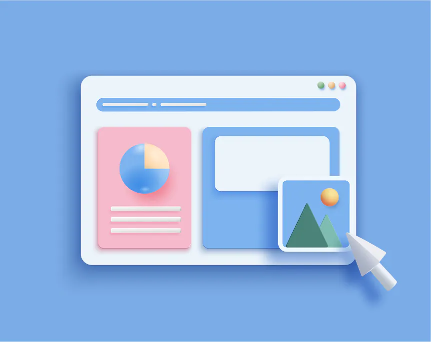
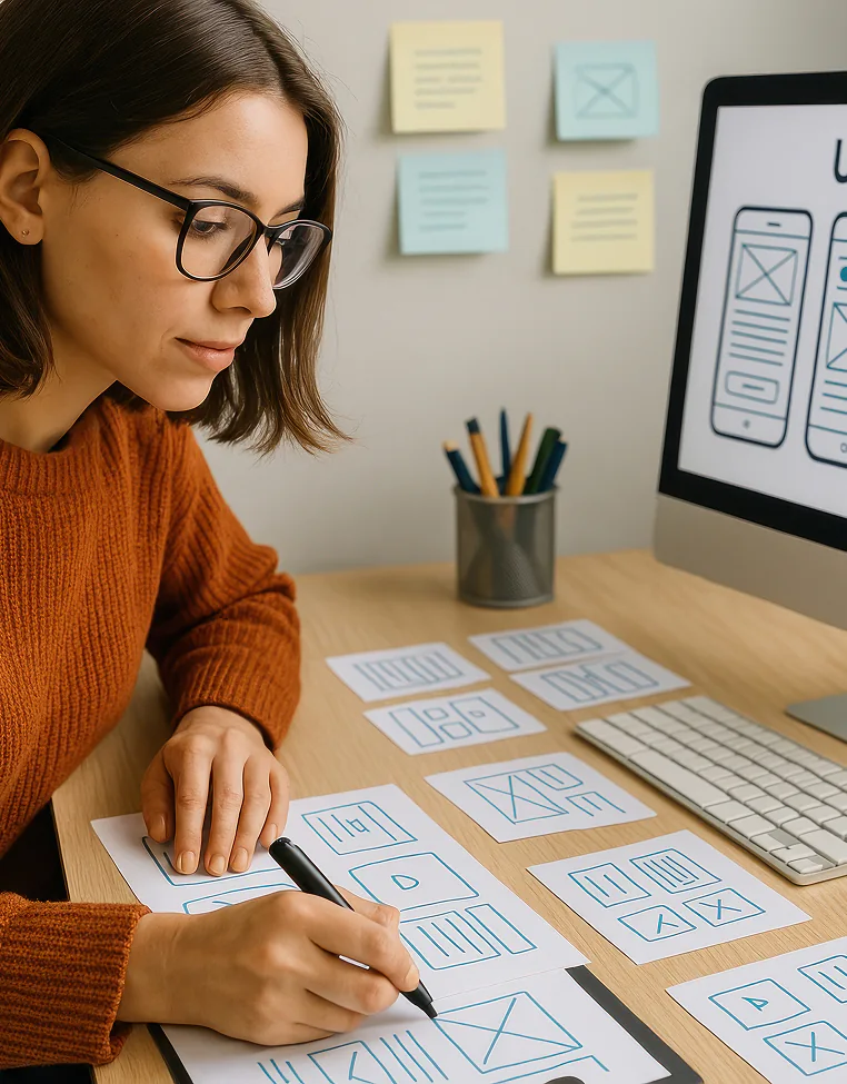
From Wireframes to Visual Language
From wireframes to visual language: Explore the UI/UX design process in 2026 with trends like immersive 3D, organic shapes & tactile maximalism. Asian IT creates captivating, brand-aligned interfaces.
Start Fast, Stay Consistent
Start Fast, Stay Consistent: The 2026 formula for digital success. Launch MVPs quickly & iterate relentlessly. Asian IT helps businesses build websites, apps & marketing that compound growth.
Design Systems That Actually Save Time
Design Systems That Actually Save Time in 2026: Cut 40–50% off design/dev cycles with reusable components & AI automation. Asian IT builds practical systems that accelerate real projects.
Our web design service is a blend of creativity, strategy, and user-centric thinking
01 / Custom design
At Asian IT we specialize in fully custom design. We create unique, modern, and brand-aligned interfaces from scratch — no generic templates. Every project starts with your vision, audience needs, and business goals, resulting in tailored wireframes, high-fidelity visuals, responsive layouts, and thoughtful micro-interactions. While we sometimes use design systems or component libraries (like Shadcn, Tailwind, or Material UI) for efficiency and consistency, the final result is always 100% custom to your brand and never looks “off-the-shelf”.
02 / Responsive layouts
At Asian IT, every website and web-based project we build is fully responsive by default. We design and develop with a mobile-first approach, ensuring your site looks perfect and functions smoothly on all devices — smartphones, tablets, laptops, and large desktop screens.
We use modern techniques like flexible grids (CSS Grid, Flexbox), media queries, relative units (%, vw/vh, rem/em), and responsive images (srcset, sizes) to deliver optimal layouts, fast loading times, and intuitive touch interactions on smaller screens. Tools such as Tailwind CSS, Bootstrap, or custom CSS help us achieve pixel-perfect responsiveness across breakpoints without compromising design or performance.
03 / User-centric focus
We always start with deep understanding of your target users: their needs, behaviors, pain points, goals, and context. Through user research, personas, journey mapping, and usability testing, we ensure every decision prioritizes intuitive navigation, effortless interactions, reduced friction, and genuine delight. Our designs feature clear hierarchies, thoughtful micro-interactions, responsive layouts, accessibility compliance, fast performance, and emotional resonance that builds trust and loyalty.
04 / Modern aesthetics
We stay current with 2026 trends — clean minimalism with bold accents, organic shapes, fluid gradients, glassmorphism, immersive scrolling, micro-interactions, kinetic typography, dark/light mode elegance, subtle 3D elements, and thoughtful negative space — while always ensuring the aesthetics serve the user experience and brand identity.
Every project features pixel-perfect visuals, harmonious color palettes, refined typography pairings, high-quality imagery/icons, and smooth animations that delight without distracting. The result is a polished, contemporary look that stands out in competitive markets, builds instant credibility, and creates emotional connection with users from the very first visit.
05 / Prototyping & feedback
We build high-fidelity, clickable prototypes (usually in Figma or Framer) that simulate real user flows, navigation, micro-interactions, animations, and responsive behavior across devices. This allows you and your stakeholders to experience the interface as users would, catch usability issues early, and provide accurate feedback.
After presenting the prototype, we collect structured feedback through review sessions, comments in Figma/Framer, or quick user testing (with real or target users when needed). We then refine the design — typically in 1–2 focused revision rounds — addressing navigation pain points, visual adjustments, content clarity, accessibility tweaks, or interaction improvements.
Find a perfect plan to launch your project with confidence
Basic
Perfect for landing pages and small websites
- Responsive Web Design
- Custom Visual Layout
- SEO Setup
- Copywriting Included
- Brand Identity Refresh
- Unlimited Revisions
Essential
Ideal for corporate websites and online stores
- Multi-Page Website
- Custom Admin Dashboard
- Module Integration
- Backend Development
- API Connections
- Analytics Setup
Advanced
Comprehensive solutions for large-scale projects
- UI/UX Strategy
- Expert Project Team
- Scalable Architecture
- Ongoing Maintenance
- Managed Hosting
- Priority Support